From Spreadsheet Struggle to Interactive Dashboard Using Claude AI
Stop staring at endless rows and columns like they owe you money. Here’s how I transformed CSV chaos into an interactive dashboard with a single prompt.
The 30-Second Game Changer
We’ve all been there – drowning in spreadsheet data, squinting at numbers that seem to blur together, trying to make sense of patterns that feel impossible to grasp. But what if I told you that you could skip the spreadsheet struggle entirely and create a professional, interactive dashboard in seconds?
Today, I’m sharing a prompting technique that completely transformed how I approach data analysis using Claude’s coding capabilities.
The Simple Setup
Uploaded a CSV file and asked Claude the following prompt:
Perform an exploratory data analysis and create an interactive dashboard to help me understand this dataset.
What Claude Built (Without Being Asked)
The resulting dashboard exceeded every expectation:
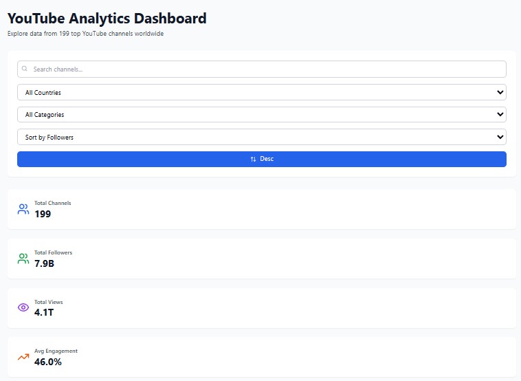
Smart Filtering System
- Country filters for drilling down by location
- Category options to focus on specific data segments
- Sort capabilities for different metrics
- All implemented automatically – I never even requested filters!
Comprehensive Overview Cards
The dashboard opened with key metrics displayed prominently:
- Total channels: clear count at a glance
- Total followers: aggregated audience reach
- Total views: cumulative engagement
- Average engagement rate: (a crucial performance indicator)

Visual Data Storytelling
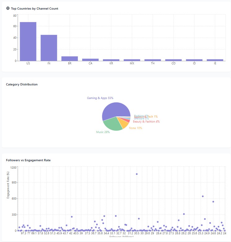
Top Countries Bar Chart The data revealed fascinating patterns: US led the pack, followed by India and Brazil. This geographic breakdown provided immediate insights into audience distribution.
Category Distribution Pie Chart Gaming emerged as the dominant category, with music taking second place. These insights would have taken hours to extract from raw spreadsheet data.
Interactive Scatter Plot: Followers vs. Engagement This was where the dashboard really shone. Hovering over data points revealed detailed information:
- One channel: 32.8 million followers with 276% engagement rate
- Another standout: 1000% engagement rate (yes, you read that right!)

The Bottom Line
What used to require:
- Hours of spreadsheet manipulation
- Complex pivot tables
- Manual chart creation
- Static, hard-to-update reports
Now takes:
- One uploaded CSV file
- One simple prompt
- 30 seconds of processing time (depending on file sizes)
Try It Yourself
Want to experiment with this technique? Here’s how:
- Find your data: Grab any CSV file (I used this dataset from Kaggle)
- Upload to Claude: Simple drag and drop
- Make the request: Ask for an interactive dashboard
- Explore the results: Click, filter, and discover insights
Beyond the Basics
The real power emerges when you start iterating. Once you understand your data through the initial dashboard, additional prompts can:
- Add more sophisticated visualisations
- Include predictive analytics
- Create specialised views for different stakeholders
- Build comprehensive reporting suites
With just a few well-crafted follow-up prompts, you can develop enterprise-level dashboards that would typically require dedicated development resources.